Polarbear.ai is a BIM platform developed by two Swedish startups.
The project required creating a geometric, text-free logo with a tech-oriented style that would abstractly represent a polar bear while incorporating data flow elements. The client drew inspiration from GitLab's animal-focused design and Airbyte.io's geometric, abstract approach.
My Approach
Based on initial research, I developed a first proposal with a modern, tech-inspired style. This design featured a polar bear in line art alongside the platform name in Quicksand font, set against a pink-to-purple gradient background.
I selected these elements for their prevalence in tech branding—the clean line art and font choice create a contemporary feel, while the gradient reinforces the tech aesthetic.
From this initial design, I created a simplified version suitable for social media icons.
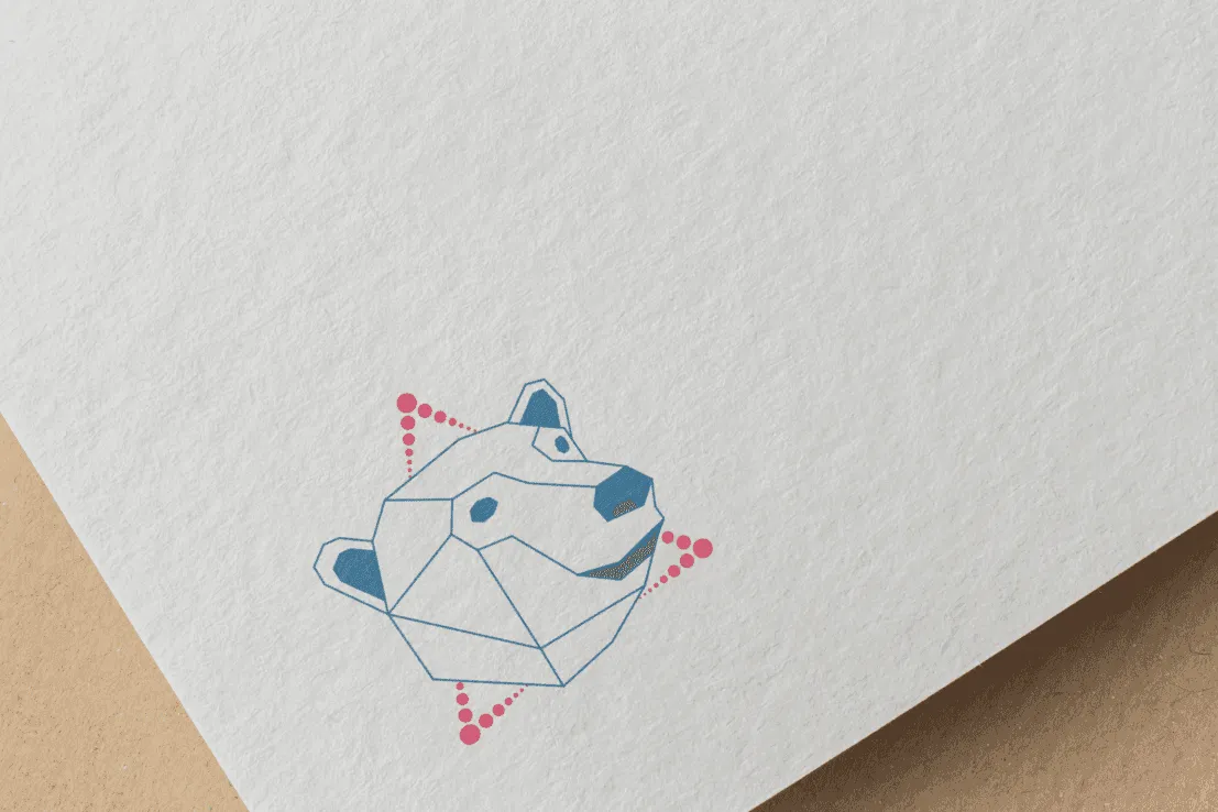
For the second proposal, I explored a more geometric approach focused on data flow visualization. This version featured a low-poly bear head combined with a triangle symbol representing data.
I created multiple variations of this concept: one showing the complete low-poly bear and another with a streamlined version. I also designed two versions of the data triangle—a solid version emphasizing the corners and an alternative with a dotted outline.
The client ultimately selected the clean low-poly bear design with the dotted triangle, appreciating its simplicity, clear data flow representation, and the bear's character.
Final Thoughts
The final Polarbear.ai logo successfully merges the geometric precision of modern tech branding with an approachable, animal-inspired design. By distilling the polar bear into clean, low-poly forms and integrating the dotted triangle motif, the logo communicates both the platform's technological sophistication and its accessibility.
This minimalist approach ensures the design remains distinctive and legible across various applications, from website headers to small social media icons. The chosen design effectively positions Polarbear.ai in the competitive BIM software market while maintaining visual harmony with contemporary tech industry aesthetics.
Through careful iteration and refinement, I achieved a logo that not only meets the client's initial vision but also creates a strong foundation for the platform's broader visual identity.
Polarbear.ai is a BIM platform developed by two Swedish startups.
The project required creating a geometric, text-free logo with a tech-oriented style that would abstractly represent a polar bear while incorporating data flow elements. The client drew inspiration from GitLab's animal-focused design and Airbyte.io's geometric, abstract approach.
My Approach
Based on initial research, I developed a first proposal with a modern, tech-inspired style. This design featured a polar bear in line art alongside the platform name in Quicksand font, set against a pink-to-purple gradient background.
I selected these elements for their prevalence in tech branding—the clean line art and font choice create a contemporary feel, while the gradient reinforces the tech aesthetic.
From this initial design, I created a simplified version suitable for social media icons.
For the second proposal, I explored a more geometric approach focused on data flow visualization. This version featured a low-poly bear head combined with a triangle symbol representing data.
I created multiple variations of this concept: one showing the complete low-poly bear and another with a streamlined version. I also designed two versions of the data triangle—a solid version emphasizing the corners and an alternative with a dotted outline.
The client ultimately selected the clean low-poly bear design with the dotted triangle, appreciating its simplicity, clear data flow representation, and the bear's character.
Final Thoughts
The final Polarbear.ai logo successfully merges the geometric precision of modern tech branding with an approachable, animal-inspired design. By distilling the polar bear into clean, low-poly forms and integrating the dotted triangle motif, the logo communicates both the platform's technological sophistication and its accessibility.
This minimalist approach ensures the design remains distinctive and legible across various applications, from website headers to small social media icons. The chosen design effectively positions Polarbear.ai in the competitive BIM software market while maintaining visual harmony with contemporary tech industry aesthetics.
Through careful iteration and refinement, I achieved a logo that not only meets the client's initial vision but also creates a strong foundation for the platform's broader visual identity.