Audrey, taking over her family's Bordeaux winery, wanted to celebrate this generational transition by renaming the business 'Les petits raisins'. Her vision was to create a fresh, modern visual identity that would stand out from traditional wine labels while honoring her family's winemaking heritage. Inspired by her love for blue, minimalist design, and clean iconography, we set out to craft a unique brand identity.
My Approach
Logo Design
I began by researching grapes and wine glasses, aiming to merge these quintessential elements into a clean, minimalist design. This research led to the development of two distinct logo concepts:
A classic design incorporating a wine glass as the stem of a grape cluster, paired with elegant typography.
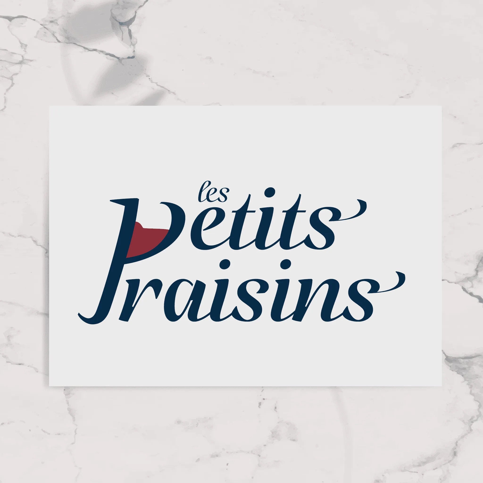
A contemporary approach transforming the wine glass into the letter "P" in "Petits".
After refining the second concept, we arrived at the final logo iteration. The 'P' became more pronounced while elegantly incorporating the wine glass motif. I enhanced the visual identity with bolder, more dynamic typography, complemented by a clean typeface for supplementary information.
Color Palette
The carefully curated color palette tells a story of sophistication and sensory experience:
Deep navy blue: Elegance and refinement
Mid-tone azure: Depth and contemporary flair
Soft sky blue: Serenity and tranquility
Rich bordeaux: Bold, intense flavors
Delicate rosé pink: Playfulness and celebration
This palette harmoniously blends tradition with modernity, appealing to both connoisseurs and casual wine enthusiasts.
Label Design
For the wine labels, I opted for a minimalist approach, featuring:
Company logo
Simple, elegant grape illustration
Mandatory regulatory text (appellation, wine type, bottle quantity, alcohol percentage)
To differentiate between wine varieties while maintaining a cohesive look, I implemented a nuanced color strategy using different blue shades. This subtle differentiation allows consumers to quickly distinguish between wine types while preserving the sophisticated visual identity.
Final Thoughts
The minimalist design ensures clarity and elegance, focusing on essential information while creating a clean, memorable visual experience. By using blue tone variations, the labels achieve both regulatory compliance and aesthetic distinction. This project successfully modernized the brand while respecting its heritage, resulting in a cohesive and impactful visual identity for Les petits raisins.
Audrey, taking over her family's Bordeaux winery, wanted to celebrate this generational transition by renaming the business 'Les petits raisins'. Her vision was to create a fresh, modern visual identity that would stand out from traditional wine labels while honoring her family's winemaking heritage. Inspired by her love for blue, minimalist design, and clean iconography, we set out to craft a unique brand identity.
My Approach
Logo Design
I began by researching grapes and wine glasses, aiming to merge these quintessential elements into a clean, minimalist design. This research led to the development of two distinct logo concepts:
A classic design incorporating a wine glass as the stem of a grape cluster, paired with elegant typography.
A contemporary approach transforming the wine glass into the letter "P" in "Petits".
After refining the second concept, we arrived at the final logo iteration. The 'P' became more pronounced while elegantly incorporating the wine glass motif. I enhanced the visual identity with bolder, more dynamic typography, complemented by a clean typeface for supplementary information.
Color Palette
The carefully curated color palette tells a story of sophistication and sensory experience:
Deep navy blue: Elegance and refinement
Mid-tone azure: Depth and contemporary flair
Soft sky blue: Serenity and tranquility
Rich bordeaux: Bold, intense flavors
Delicate rosé pink: Playfulness and celebration
This palette harmoniously blends tradition with modernity, appealing to both connoisseurs and casual wine enthusiasts.
Label Design
For the wine labels, I opted for a minimalist approach, featuring:
Company logo
Simple, elegant grape illustration
Mandatory regulatory text (appellation, wine type, bottle quantity, alcohol percentage)
To differentiate between wine varieties while maintaining a cohesive look, I implemented a nuanced color strategy using different blue shades. This subtle differentiation allows consumers to quickly distinguish between wine types while preserving the sophisticated visual identity.
Final Thoughts
The minimalist design ensures clarity and elegance, focusing on essential information while creating a clean, memorable visual experience. By using blue tone variations, the labels achieve both regulatory compliance and aesthetic distinction. This project successfully modernized the brand while respecting its heritage, resulting in a cohesive and impactful visual identity for Les petits raisins.