Brew Bliss, an innovative Bubble Tea brand, seeks a vibrant and engaging visual identity that embodies its lively and sparkling personality. This project involves designing a cohesive branding suite, including a logo and packaging for its inaugural point of sale.
Objectives
Reflect the brand's core values: creativity, quality, and community
Capture the joy and excitement of experiencing a distinctive Bubble Tea
Create visuals that align with the brand's fresh and refined image
Key Deliverables
Logo Design: A dynamic logo that conveys the brand's effervescent spirit.
Beverage Packaging: Eye-catching packaging that highlights freshness and creativity.
Menu Design: A visually appealing menu to enhance the customer experience.
Business Cards: Professional yet playful cards to represent Brew Bliss.
My Approach
I began by immersing myself in the world of bubble tea shops, studying their visual language. However, I wanted to create something truly distinctive. The breakthrough came when I decided to develop a mascot-centered logo, a strategic choice that perfectly aligned with our vision for an energetic, approachable brand identity.
Logo Design
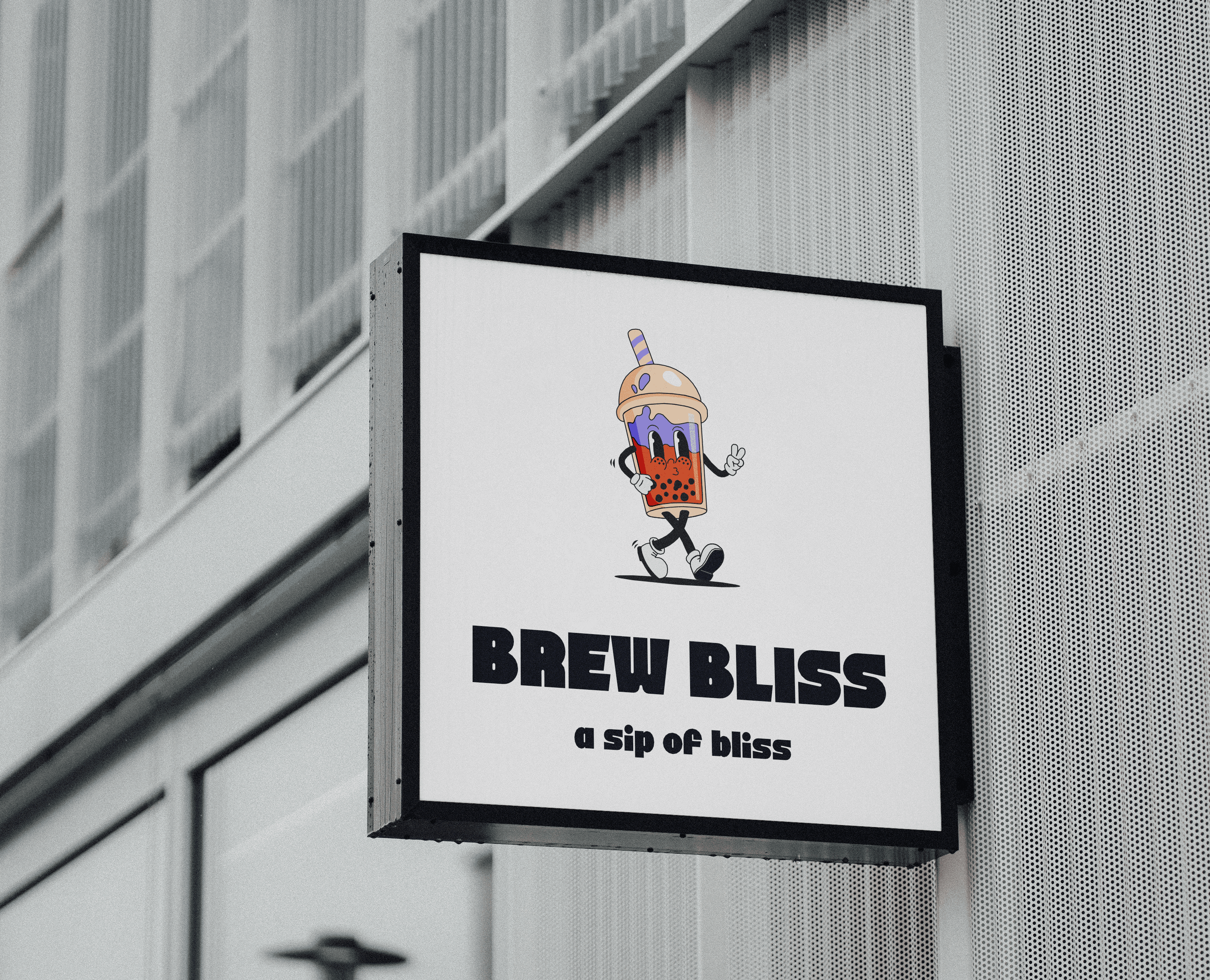
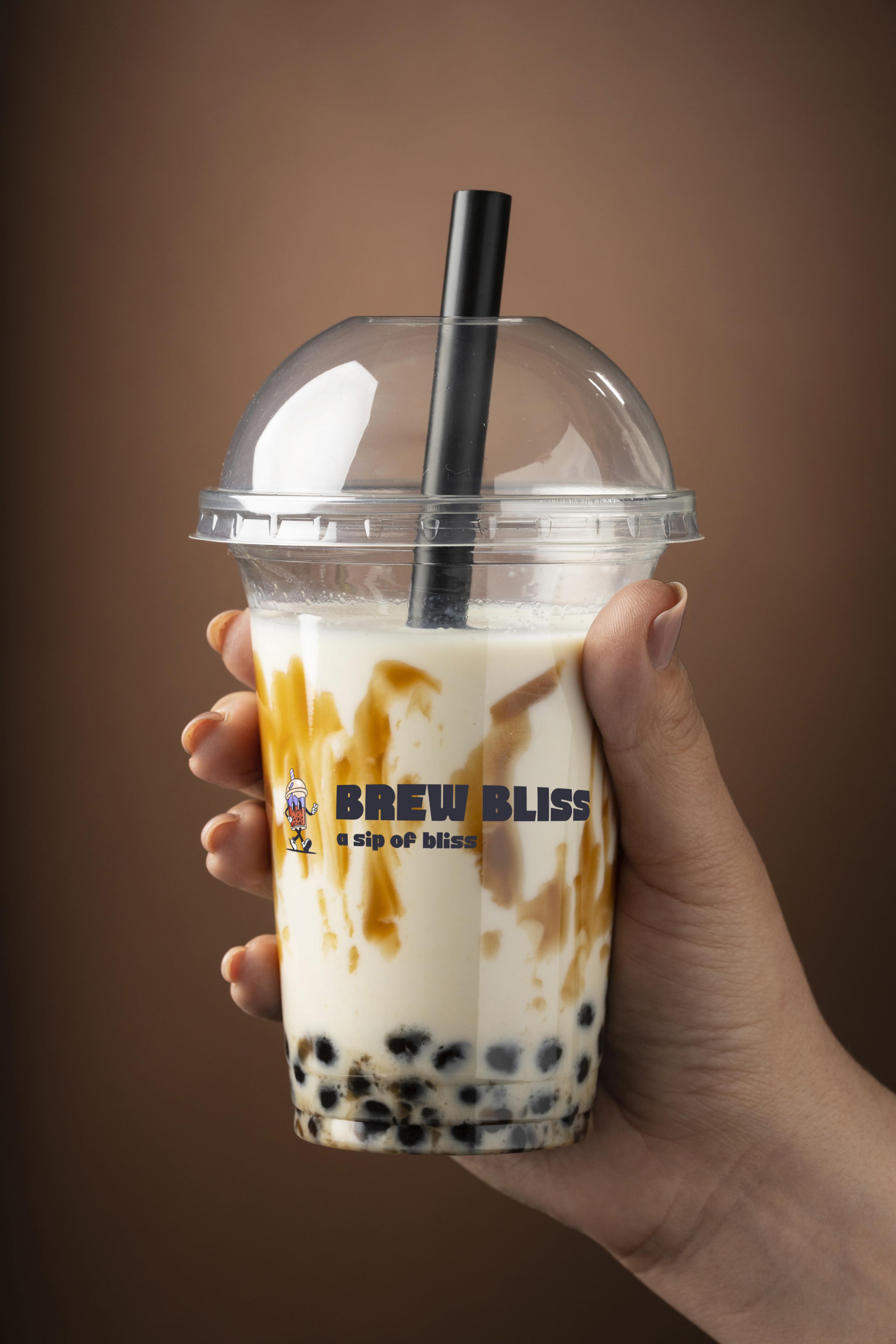
Drawing inspiration from vintage cartoon aesthetics, I sketched various Bubble Tea elements before settling on the iconic cup as the perfect embodiment of the beverage. The final design features a Bubble Tea cup with a cool, laid-back expression, casually strolling rightward. This character captures both the refreshing essence of the drink and the brand's forward-moving energy.
Color Palette
I carefully selected a color palette that strikes a balance between vibrant energy and understated sophistication:
Burnt sienna: Captures Brew Bliss's creative spirit
Tropical indigo: Reflects the refined nature of Brew Bliss’s offerings
Almond: Acts as a neutral anchor
Light green: Introduces vitality and contemporary appeal
Raisin black: Adds a vintage quality and essential contrast
This vibrant color palette, inspired by the ingredients and fun aspect of bubble tea, injects life into the brand identity.
Typography
For typefaces, I chose Alinsa as the primary font, bringing a playful yet contemporary feel. Din Condensed serves as the secondary typeface, ensuring excellent readability across all marketing materials.
Packaging Design
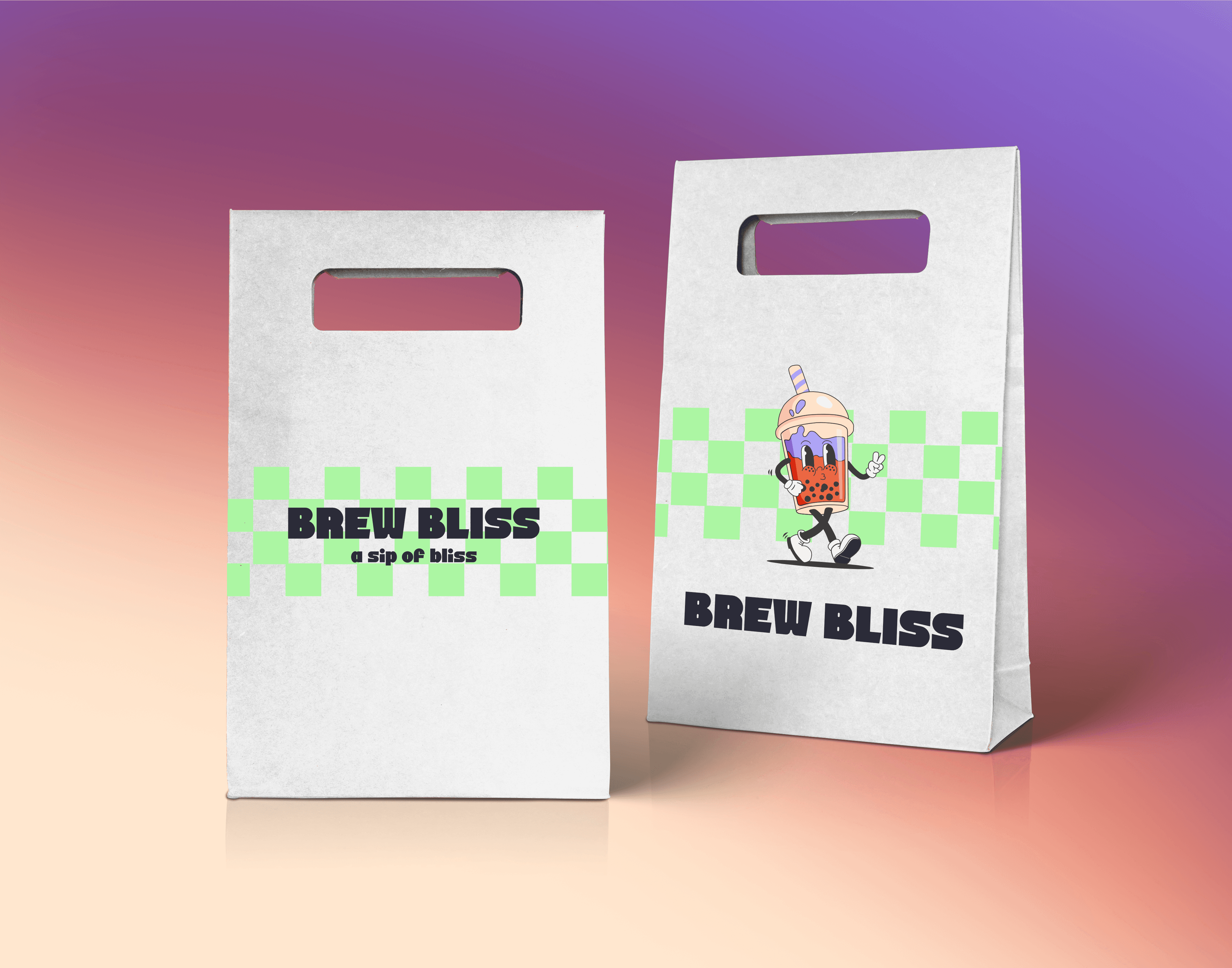
The packaging design features clean, playful elements that embody the cheerful personality of the brand. I created two bag variations:
Logotype with a light green checkerboard pattern
Incorporation of the mascot character
The strategic use of white space and the light green pattern adds energy without overwhelming the design. The “BREW BLISS” logotype stands out in bold, black letters, with the tagline “a sip of bliss” reinforcing the brand promise.
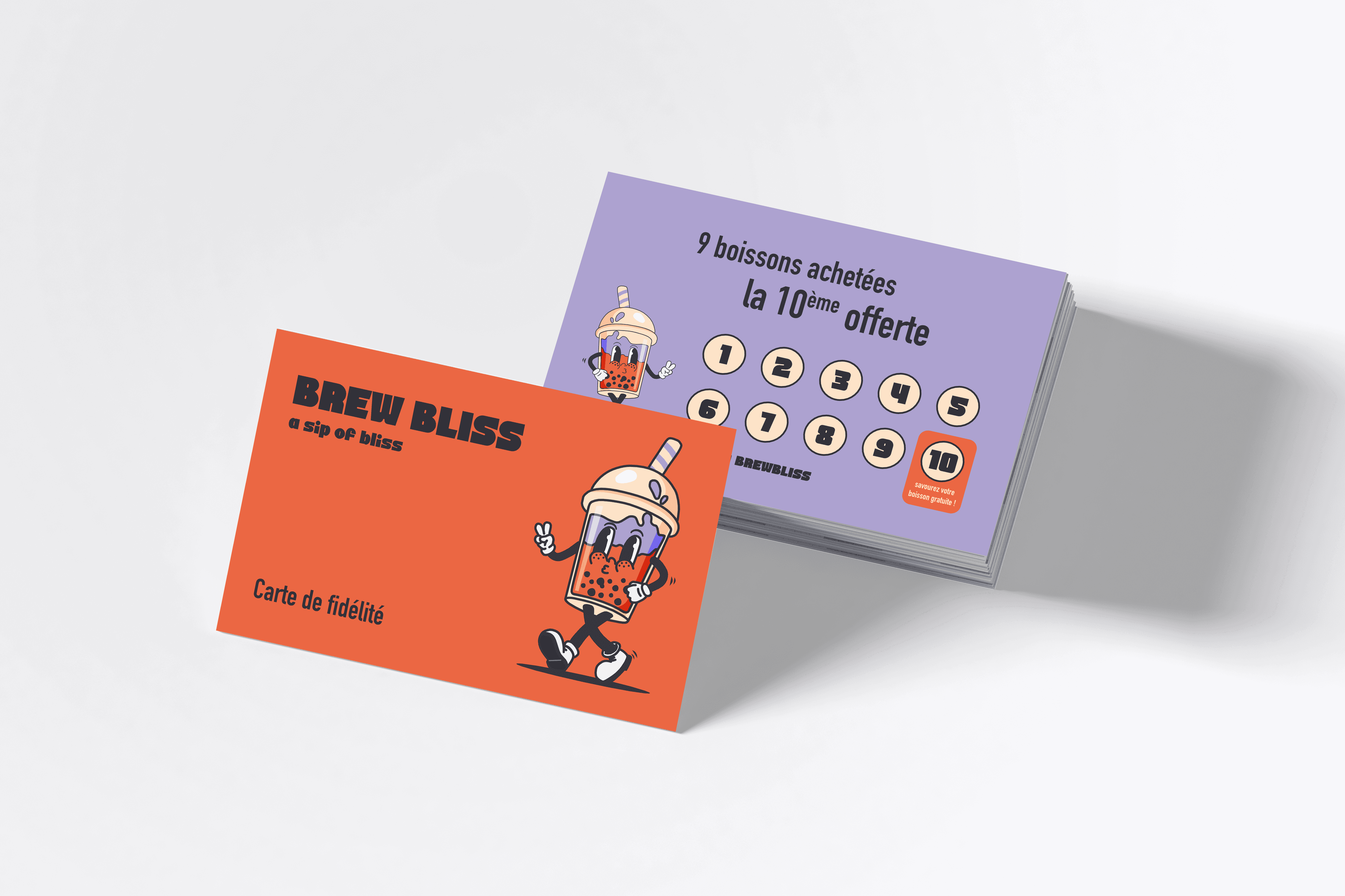
Menu & Loyalty Card

For the menu, I designed a clean, organized layout with color-coded sections for different drink categories. The main logo appears subtly at the top, maintaining brand consistency.
The loyalty card features:
Front: Mascot character on a vibrant orange background
Back: Purple shade with the loyalty program offer and 10 circular punch spots
Both the menu and loyalty card utilize the cohesive color palette of orange, purple, and green, creating a consistent brand identity while keeping each element distinct and engaging.
Final Thoughts
The result is a cohesive, vibrant, and memorable brand identity that sets Brew Bliss apart in the competitive bubble tea market. The playful mascot, energetic color palette, and thoughtful design elements work together to create an unforgettable experience for customers, perfectly capturing the joy and excitement of Brew Bliss's distinctive bubble tea offerings.
Brew Bliss, an innovative Bubble Tea brand, seeks a vibrant and engaging visual identity that embodies its lively and sparkling personality. This project involves designing a cohesive branding suite, including a logo and packaging for its inaugural point of sale.
Objectives
Reflect the brand's core values: creativity, quality, and community
Capture the joy and excitement of experiencing a distinctive Bubble Tea
Create visuals that align with the brand's fresh and refined image
Key Deliverables
Logo Design: A dynamic logo that conveys the brand's effervescent spirit.
Beverage Packaging: Eye-catching packaging that highlights freshness and creativity.
Menu Design: A visually appealing menu to enhance the customer experience.
Business Cards: Professional yet playful cards to represent Brew Bliss.
My Approach
I began by immersing myself in the world of bubble tea shops, studying their visual language. However, I wanted to create something truly distinctive. The breakthrough came when I decided to develop a mascot-centered logo, a strategic choice that perfectly aligned with our vision for an energetic, approachable brand identity.
Logo Design
Drawing inspiration from vintage cartoon aesthetics, I sketched various Bubble Tea elements before settling on the iconic cup as the perfect embodiment of the beverage. The final design features a Bubble Tea cup with a cool, laid-back expression, casually strolling rightward. This character captures both the refreshing essence of the drink and the brand's forward-moving energy.
Color Palette
I carefully selected a color palette that strikes a balance between vibrant energy and understated sophistication:
Burnt sienna: Captures Brew Bliss's creative spirit
Tropical indigo: Reflects the refined nature of Brew Bliss’s offerings
Almond: Acts as a neutral anchor
Light green: Introduces vitality and contemporary appeal
Raisin black: Adds a vintage quality and essential contrast
This vibrant color palette, inspired by the ingredients and fun aspect of bubble tea, injects life into the brand identity.
Typography
For typefaces, I chose Alinsa as the primary font, bringing a playful yet contemporary feel. Din Condensed serves as the secondary typeface, ensuring excellent readability across all marketing materials.
Packaging Design
The packaging design features clean, playful elements that embody the cheerful personality of the brand. I created two bag variations:
Logotype with a light green checkerboard pattern
Incorporation of the mascot character
The strategic use of white space and the light green pattern adds energy without overwhelming the design. The “BREW BLISS” logotype stands out in bold, black letters, with the tagline “a sip of bliss” reinforcing the brand promise.
Menu & Loyalty Card
For the menu, I designed a clean, organized layout with color-coded sections for different drink categories. The main logo appears subtly at the top, maintaining brand consistency.
The loyalty card features:
Front: Mascot character on a vibrant orange background
Back: Purple shade with the loyalty program offer and 10 circular punch spots
Both the menu and loyalty card utilize the cohesive color palette of orange, purple, and green, creating a consistent brand identity while keeping each element distinct and engaging.
Final Thoughts
The result is a cohesive, vibrant, and memorable brand identity that sets Brew Bliss apart in the competitive bubble tea market. The playful mascot, energetic color palette, and thoughtful design elements work together to create an unforgettable experience for customers, perfectly capturing the joy and excitement of Brew Bliss's distinctive bubble tea offerings.